But How the Witch Wailed and How the Cat Spat...

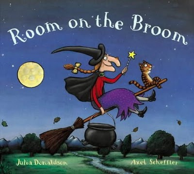
Room on the Broom by Julia Donaldson
Illustrated by Axel Scheffler

This book has great rhythm, great rhyme -- it almost seems like it was written by a modern-day Romantic poet. The rhythm asserts itself the moment you start reading, and there is never a stumble.

Great for toddler participation.

Eliza has two parts she likes to say. First, as each new animal asks to get onboard the broom, the refrain is "Is there room on the broom for a dog like me?" And the next line is "Yes!". Well, Eliza is very excited to give her permission: "YES!" she says.

The next line she loves is: "The witch tapped the broomstick and WHOOSH! They were gone." She really gets into that "whoosh", let me tell you!

So, whether it's Halloween or not, this is a fun one.


The Best of Boynton

I feel very remiss not getting some Sandra Boynton recommendations up here sooner. She has earned herself a very respectable share of the real estate in the board book section at the bookstore. In fact, there are so many Boyntons, which ones should you choose?

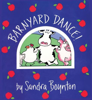
In my opinion, every board book library should include at least these two:


The rhythm and rhyme work great in these two (some of the others are a little rougher, though still funny). Barnyard Dance sounds like a Square Dance caller, so you might find yourself adding a bit of Southern twang to it. It is really catchy. In fact, I think both Eliza and I have memorized it at this point.

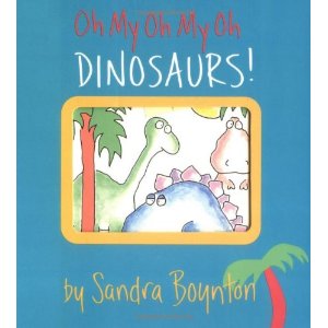
We have also memorized Oh My Oh My Oh Dinosaurs. It's got colors, feelings, opposites in it... Lots of fun. Now that Eliza is talking more I will often leave off words in the rhyme, and she will fill them in. It starts off like this:
Dinosaurs happy.
Dinosaurs sad.
Dinosaurs good.
Dinosaurs bad.

And, later on, it gets funnier:

Dinosaurs early.
Dinosaurs later.
Dinosaurs crammed in an elevator.

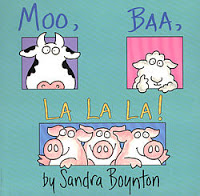
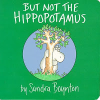
There a few other Boyntons I particularly like, namely Moo Ba La La La and But Not the Hippopotamus:


So, anyway, those are our faves!

More Claus!


Okay, so it has been far too long. It's because I moved across the country, started going to graduate school, etc. But now I am back because I have a few recommendations that I really want to share.

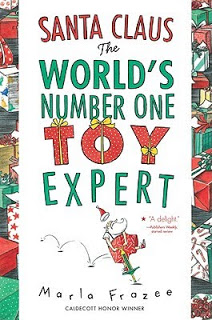
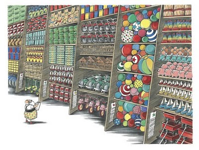
As we head into the holiday season, if you are looking for a way to introduce Santa Claus to your little one, I have found a Christmas gem by Marla Frazee. Marla (who is a two-time Caldecott honoree and the illustrator of the popular Clementine series) has totally and wonderfully captured the fantasy of Santa Claus. We see Santa's warehouse full of toys on three-story-high shelves, his wall of wrapping paper, his tiny filing cabinets filled with post-it sized notes about children he will be choosing gifts for.... We see Santa testing the pogo stick and the bubbles... We see him in his giant billowing boxers shorts of all sorts of hilarious patterns... And, as my toddler likes to point out, his "Coffee cup!" is everywhere (it starts with one and by the end he has about twenty of them).

The text is actually not particularly stunning, but we can forgive that because we can have so much fun with the pictures. And hey, this text is introducing my toddler to the phrase "99.9% of the time" (this is how often Santa correctly matches the exactly right toy to the exactly right child).

This book is definitely a hit--- Eliza requested this book twice tonight, saying "More Claus!" the second time.

So, anyway, just wanted to recommend this one. I noticed it's on sale at Amazon for $12! Bargain!

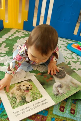
Baby Likes Upside-Down Books


These days, when Eliza looks at books by herself, more often than not, they are upside down. And sometimes, when we read together, she will grab the book and turn it upside down. Has anyone else experienced this?

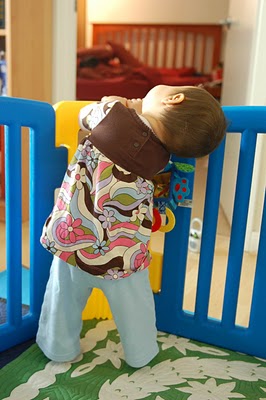
She is also into head-tilting these days. It almost seems like she has discovered the idea that she can look at things different ways...


Parrots Squawk . . . But I Talk!


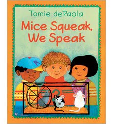
Mice Squeak, We Speak by Tomie dePaola

Do you remember Strega Nona? This is by the same author/illustrator. It was recommended to me by a fellow editor who also works at a bookstore. Back when I first went back to work and was too exhausted to shop (and did not want to buy all my books on Amazon), I gave her $30 and asked her to buy me some good board books with simple rhyming text and bright colors. This is one of the books she got me. Good pick!

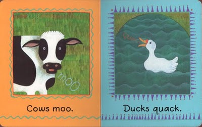
It's colorful, and the text is short and simple to read... just two or three words per page. It's all about animal sounds, like so:


There is rhyme every other line....

Monkeys chatter
Cows moo
Ducks quack
Doves coo
Pigs squeal
Horses neigh
Chickens cluck
[turn page to find three kids, one of whom says...]
But I say!

I don't actually do the animal sounds . . . but later I can imagine Eliza wanting to do that as we read. So anyway, that's what I say about this one!

An "I Love You" Book


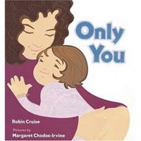
Only You by Robin Cruise, illustrated by Margaret Chodos-Irvine

No child's library would be complete without a warm and fuzzy "I Love You" book or two, and this is a very good one. It is not a board book
(I wish it were), but still, I think it's good for a baby. We read it almost every night.

The text is a simple poem in three parts. The first part is set in the morning with a mom and her baby. The second part is in the afternoon with a dad and his toddler boy. The third part is in the evening with a mom and her preschool-age daughter.

Essentially, it's a love song from a parent to a child.

An excerpt:

When the sky glows peachy-rose at dawn,
I love the way you stretch and yawn.
I love your mouth,
your ears,
your eyes.
I love your happy wake-up cries.

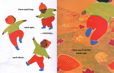
As you can see, it is dripping with sweetness-- "love" is in every sentence. And the art, by a Caldecott honoree, is good -- simple and sweet like the text:


I should say that even though the title is "Only You," the idea is not that the parent loves "only you," or that the book is for only children (which is what I thought when I picked it up). The title comes from the last line of the book, which is: "I love my one, my only, you."

Anyway, I give this one a thumbs up, even though I was highly allergic to sentimental stuff in my pre-baby life. I have to say, after having been away at work all day, I like sitting with my baby and reading words like these to her.

Eliza seems to like it, too. I often play a game with her where I hold up two books and say "Which one shall we read?", and when I offer this one, she almost always picks it!

Front Feet, Back Feet... Feet, Feet, Feet!


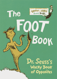
The Foot Book by Dr. Seuss

This is another book that I salute for having a rhythm that is perfectly suited to its content. Like Chugga-Chugga Choo Choo by Kevin Lewis, which has the rhythm of a train, this book about feet has a "marching" rhythm.

Here is how it begins:

Left foot
Left foot
Right foot
Right

Feet in the day
Feet in the night

Doesn't it sound like marching? I think so anyway.

It goes on:

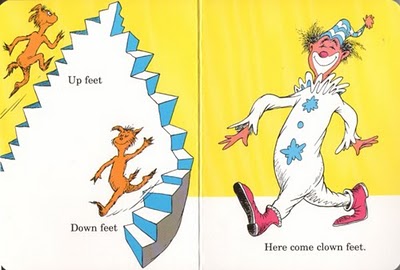
Up feet
Down feet
Here come clown feet!

(My husband likes to say "Broken arm clown feet" for that last line because Seuss has taken some artistic liberties on one of the clown's elbows...)


I happen to like crazy elbows!

Anyway, bravo, Seuss! Another brilliant book.

Echo Calling... Whooooo! Whooooo!


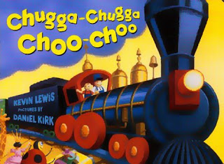
Chugga-Chugga Choo-Choo by Kevin Lewis, illustrated by Daniel Kirk

This is a brilliant book. If Shakespeare were alive today and wanted to read a contemporary book to a baby, I would hand him this one. No kidding.

I say this because there is unusually clever and clean use of poetic meter in this book-- Kevin Lewis has taken the meter of "chugga chugga choo choo" and made a poem out of it.

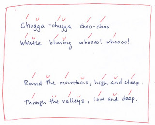
"Chugga chugga choo choo" has a falling meter, made of two trochees and a spondee. The English major in me was dying to scan the text, so here it is:

As you can see, the final part of each line is not always a spondee-- in fact, Lewis usually has an unstressed syllable between the two stressed syllables. But you know, when you say "Choooo Choooo" with an extended "ooooo" sound, there is a tiny pause after the first oooo, (almost chew-uh-chew), so it works great that way.

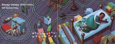
Anyway, I love reading this book. Love love love it. My husband and I will often say lines in call-and-response fashion when we're playing with our daughter... He'll say "whistle blowing," and I'll say "whooo-whooo." Or I'll say "echo calling," and he'll say "whooo-whooo."

The art is vibrant and beautiful, too. The idea is that we're in a little boy's room with his toy train set. The toy train goes under the boy's bed when the text talks about going "into tunnels, underground," and the train goes across his fish tank when the text says "across the river, swift and wide, a bridge goes to the other side." So, there's visual cleverness, too.


And, finally, as you can see from the last spread (above), the book has a bedtime theme, so it fits in that "bedtime story" slot, if you are in need of another.

So, bravo, author and illustrator-- you both get high marks from this editor!

Now YOU feel Daddy's scratchy face!


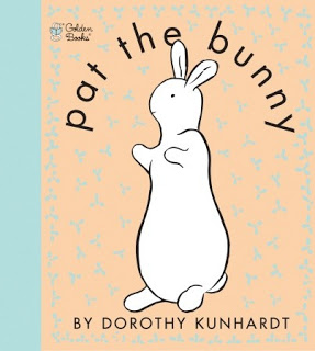
Pat the Bunny by Dorothy Kunhardt

It took my baby a while to warm up to this book. Perhaps the quiet, pastel-hued art just didn't grab her. Also, touch-and-feel didn't really interest her until about 7 months. (She liked other touch-and-feel books before this one.)

The first spread she wanted to play with was "Now YOU play peek-a-boo with Paul." She would grab the little turquoise cloth flap and peek at Paul. So, it was a lift-the-flap experience first. (She liked lift-the-flap before touch-and-feel.)

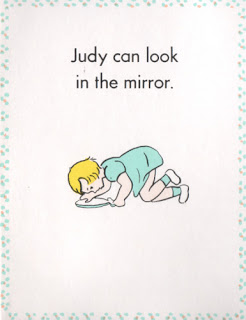
Then she liked flipping through "Judy's book." Another lift-the-flap experience.

Daddy's scratchy face was the first texture she would touch. Then, later, it became her favorite page (indicated by her smiling, laughing, and/or looking up at me when we would turn to it). It's funny, because she likes to play with her own dad's "scratchy face." In fact, my husband has a little goatee just for her. Is it possible that she was making the connection to her real-life experience? I really think so!

Here is a picture of her touching her uncle's scratchy beard, making the same scrunchy-face smile she makes when we turn to the page in Pat the Bunny.


Anyway, I like to think she makes the connection!

Eliza also likes the mirror spread. She will peek in it and make eye contact with me through the mirror (and smile!). I must say, though -- the art on the mirror spread is one of the lamest pieces of children's book art I have ever seen. Come on, Dorothy! Who looks at a hand-held mirror like that? Did Judy fall over?


Eliza also likes to stick her index finger through "Mummy's ring." It is so cute to see her work her tiny finger through that hole. Takes some dexterity, I think!

Anyway, the funniest thing about our experience with this book is that Eliza refused to "pat the bunny" for the longest time. She would interact with every other page (she would even touch the flowers, which are meant to be sniffed-- lost on her)... but the bunny was always ignored. If I tried to put her hand on the bunny, she would yank her hand out of mine very quickly.

Finally, just a few days ago (right around 9 months), her little hand ventured to touch the bunny fur. It was the very last feature she found. Oh, the irony.

The amazing thing to me is that they still bind this book with a plastic comb binding. My daughter considers this one the touch-and-feel features, as she will frequently touch that part of the book (in fact, she touched that part of the bunny spread before the bunny). My daughter also likes to chew on this book more than any other, and she has managed to get bits of paper off the spine. So, we don't let her play with this book unsupervised.

Anyway, I recommend this book as a "stage two" infant/toddler book, after your child has learned to enjoy flaps and textures in other books.

So They Sent Me a... LION!


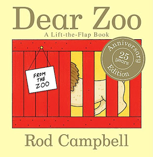
Dear Zoo, written and illustrated by Rod Campbell

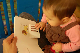
Eliza LOVES this one. She is very interested in lifting flaps right now (at eight months old), and this book seems to really please her. She is so eager to lift the flaps, she springs to grab each flap as soon as we turn the page, as if to beat me to it.

The premise is:"I wrote to the zoo to send me a pet. They sent me a... [lift flap to reveal animal]. It was too [insert adjective]. I sent him back." This repeats from elephant (too big) down to frog (too jumpy). It ends with the zoo sending a dog, which was perfect.

The only critique I have is that the flaps are not baby-friendly. They are recessed into the page. To help with this, I secretly "prep" each flap before turning the page-- I reach under the page we're reading to make the flap on the next page just slightly "ajar" so she can get her fingers under it. (Unfortunately in her frantic efforts to grab the flap she can sometimes push it back down. So, I will help again. The funny thing is, once she sees me touch the flap, she is usually not interested in grabbing it anymore and instead turns the page to get to the next one. Miss Independent!)

Here are some pics of her in action:


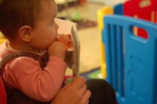
And, of course, the flaps must be tasted:


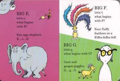
Four Fluffy Feathers on a Fiffer Feffer Feff!


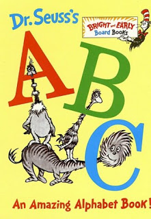
Dr. Seuss's ABC: An Amazing Alphabet Book

I like sharing this book with Eliza. She is too little to learn her ABCs, but since she is learning to speak, I like that this book covers the range of sounds of our language.

The text follows pretty much the same formula for every letter:


It is a lot of text for a baby, as you can see. I don't read all of the text every reading, necessarily-- if she is getting impatient and turns the page, we just skip a letter that time. I generally read no more than two letters per spread (some spreads feature up to four letters).

As you can expect with Dr. Seuss, the rhythm, rhyme, and nonsense humor are perfectly honed.

This book and Mr. Brown Can Moo, Can You?, There's a Wocket in My Pocket, and The Foot Book are our favorite Dr. Seuss books for her right now (I'll review them later). Many of the others have just too much text at the moment...though I have already purchased The Cat in the Hat and Oh, the Places You'll Go! for her... for later!

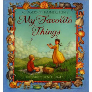
Bright Copper Kettles and Warm Woolen Mittens


A Few of My Favorite Things, song by Rodgers and Hammerstein, illustrated by Renee Graef

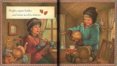
I love this song, and I love the way it's illustrated in this book. It's a sweet, painterly style. Each scene includes a little girl and usually also her brother. The world of this pair reminds me of my childhood in Maryland-- particularly the fall and winter months (which are so different for me now that I live in the San Francisco Bay Area).

Here is one of my favorite spreads:


That just says "late October afternoon" to me.

I don't read many "regular paper" picture books with Eliza, because she can suddenly decide she wants to crumble, tear, and eat the pages. However, if she is mellow enough, she can even help turn these pages if I prop them up for her.

I shouldn't say I "read" this to her, because I find I am actually unable to just read it-- it must be sung, just like Julie Andrews did. I try anyway.

You should hear me on the last spread:

"And then I don't feeeeeeeeeeeeeel soooooooooooooooooooooo baaaaaaaaaaaaaaaaaaaad."

Anyway, if you love the Sound of Music, and if this song is an old familiar favorite of yours, this book captures it just right. I just wish they would make a board book out of it.

It's Very Good to Hear with Ears!


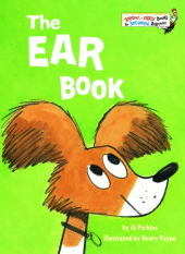
The Ear Book
by Al Perkins, illustrated by Henry Payne

This is such a good one! Eliza has lots of "Bright and Early Board Books," and this one is one of my favorites. The text has great rhythm and rhyme for reading aloud.

Here is an example:


The art style, the characters, and places feel like they are from a quieter time decades ago (this was published in 1968). I like that a lot.

The text has some Dick-and-Jane-esque repetition, with sentences like:

It's good. It's good to hear with ears!

And yet it's not dry to read.

Highly recommended.

It's very good to read the ear book!

The "That's Not My" Franchise


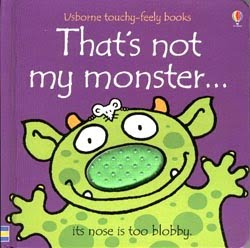
That's not my monster...
by Fiona Watt, illustrated by Rachel Wells

This is the first touch-and-feel book my baby would actually touch. (We also frequently read Pat the Bunny, but she still is very hesitant about touching that bunny!)

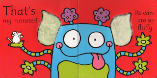
Each spread shows a monster that is not "mine" because it has, for example, horns that are too rough. Then, at the end, we find "my" monster!


My daughter loves those ears!

As evidenced by the entire shelf of "That's not my" iterations at my local Barnes and Noble, including "That's not my tractor" (!), the publisher, Usborne, is doing quite well with these.

I have browsed them all, and we also own That' s not my dolly...

But this one is my favorite, because those monsters are just so cute. My husband feels the same way. And I think Eliza does too! (She kissed one of the monsters tonight -- either that or she was just tasting him.)

Things You Might Not Have Known About Goodnight Moon


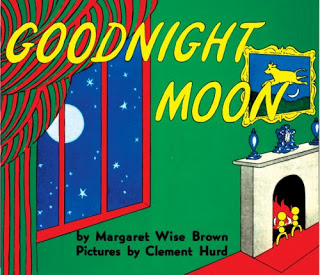
Goodnight Moon by Margaret Wise Brown, illustrated by Clement Hurd

I have read this book at least once per night since Eliza was three months old. And I have not gotten sick of it-- that is the magic of Goodnight Moon for you!

During my four-month study, I have managed to notice a few things about this dear old classic. Here is my current list:
  • You can hunt for the mouse in every scene.
  • The moon rises higher each time it’s in the window.
  • A copy of Goodnight Moon is on the nightstand, all green though.
  • A copy of Runaway Bunny (by the same author and illustrator) is on the bookshelf, also all green.
  • The socks on the rack disappear when we say goodnight to the mittens on the rack. This was surely to avoid the oddness of looking at socks *and* mittens while bidding goodnight only to the mittens. (The socks get their turn with the clocks.)
  • The red balloon is sometimes visible in the corner of the room, sometimes not. I imagine it floating around the room, phantom-like.
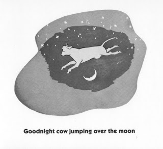
  • The teats appear to have been edited out of the cow jumping over the moon—they seem to be painted over, sometimes not so well. Since I work in publishing, I imagine some executive-level person being uncomfortable with the teats, and the art having to be corrected. Who knows!
  • The cow jumping over the moon appears in the Three Little Bears painting, too.
Now if I put on my "children's book editor" hat, I can tell you a few other things I notice... If you can bear with me...
  • The word "goodnight" actually does not (yet) exist as one word in English. It is two words according to Websters (and therefore to the proofreaders of the world). You would think the sheer force of Goodnight Moon would have forced Websters to concede. But alas. (There are lots of similar situations, where common usage has married two words and Websters insists that the union is not legal. Rain forest and shoe box are examples. Or, sometimes Websters allows two words that are commonly married to be joined with a hyphen, kind of like a domestic partnership. "Good-bye" is in this camp. Issues like these force copy editors and proofreaders to wear down a lot of pencils.)
  • There is no punctuation in Goodnight Moon. No periods to end sentences. Nothing. I suppose a copy editor could look the other way because it's poetry.
And about the art. . .
  • You know how there is a limited palette of colors? Goodnight Moon was published so long ago (1947), it was before our normal four-color printing process came along. So, each of those colors was its own color plate. It looks to me like they had a red plate, a blue plate, a yellow plate, and a black plate. I bet the green was made by printing the yellow on top of the blue. So, imagine the page being composed of several layers of tracing paper, one layer for each color. Everything that was red on the page would have been rendered by the artist in black on the "red layer." Then the red printing plate would have been made out of that layer. So, you would have only seen the scene in color once it was printed... Not an easy way to illustrate a book! (Now, fyi, Goodnight Moon is printed on a normal four-color press. It's much more expensive to print it the old way now.)
  • A longtime veteran in the children's book world, Christopher Franceschelli (who founded Handprint Books), told me that the reason the book has alternating color spreads and black-and-white spreads is because that was a common money-saving technique back when GM was published. So, instead of printing the whole book in color, they printed only half of it in color. Impressive how they made it seem completely intentional (as if it was done for visual variety and pacing), alternating between quiet vignettes and full-room scenes!
Eliza is calling me now... Better go! Goodbye for now! (Or Good-bye!)

Don't Mess with Brown Bear


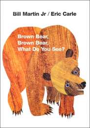
Brown Bear, Brown Bear, What Do You See?
by Bill Martin Jr., illustrated by Eric Carle

This is one of those perfect "first books" for baby. The repetition, rhyme, rhythm, and short text are ideal for reading aloud to a baby. The art is wonderfully vibrant and simple--bold colors and big shapes on plain white backgrounds. When you put this art and text together, you have something that pleases baby's eyes AND ears-- and really holds her attention.

Each page goes like this:

Red bird, red bird,
What do you see?

I see a yellow duck
looking at me!

This text became so familiar to my daughter that when we hand her a yellow rubber ducky in the bath, we say, "Yellow duck, yellow duck, what do you see? I see Eliza looking at me!" She loves it! We also do "I see mama looking at me" and "I see dada looking at me" when we look in the mirror. Endless fun to be had with "what do you see" and "looking at me"!

So, of course, given Miss E's excitement with this text, I went out to get a sequel. I have looked at all three (Panda Bear, Panda Bear, What Do You See?, Polar Bear, Polar Bear, What Do You Hear? and Baby Bear, Baby Bear, What Do You Hear?). And the winner is . . .
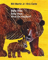
Baby Bear, Baby Bear, What Do You See?
by Bill Martin Jr, illustrated by Eric Carle

This is actually the most recent of the sequels, published in 2007, forty years after Brown Bear was published (in 1967). Brown Bear was actually Eric Carle's first book (though the art on the current board book cover, shown at the top of this post, is revised art he did for the 25th anniversary edition).

What I love about Baby Bear is that it holds true to the two things I love about Brown Bear: 1) The wonderful rhythm of the text and 2) The simplicity of the art. I think both Polar Bear and Panda Bear mess with the formula too much.

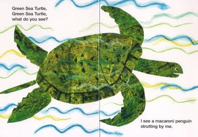
Panda Bear is particularly atrocious when it comes to the rhythm. Because it is trying to feature endangered animals, the text becomes encumbered, as many of the animals have names that are too long to work in the rhythm (which is meant for a two-syllable animal name -- or maybe three syllables if one can be swallowed a bit!). Here is an example of the terrible rhythm:


from Panda Bear, Panda Bear, What Do You See?

Come on! Green sea turtle? Macaroni penguin? Talk about awkward mouthfuls! As the notion of "endangered species" is completely lost on my baby (and on most of the readership, really), I take the liberty of editing the text as I read it. So, Eliza just hears: "Turtle, turtle, what do you see?" And "I see a penguin strutting by me." I recommend that to anyone who wants to salvage Panda Bear. This book could have been great if the names had been done in short form. The full names of the endangered species could have been featured on an explanatory spread in the back (for the upper end of the readership, and for adults!).

Anyway, back to Baby Bear-- the art is also more like Brown Bear in that the backgrounds are kept pure white, so there's plenty of stark contrast. Panda Bear has some painted backgrounds (and squiggly line backgrounds like the one above) that can cause the animals to get a bit lost.

One small critique of Baby Bear-- they could have chosen a few more non-brown animals! Even in keeping with the North America theme, there's room for a yellow or green animal... And I also have to forgive the author for this stumbler: "I see a striped skunk strutting by me." ("Striped skunk, striped skunk what do you see" then follows... not so easy on the read-alouder!)

So, anyway, if you love Brown Bear and want another one, I'd say try Baby Bear next, as it's the closest sibling. Then try Panda Bear with edits. As for Polar Bear, well, that's up to you. I left that one in the store myself, as it departed a lot from the formula ("what do you hear" instead of "what do you see", and I didn't love the text). It's more of a cousin than a sibling...

Anyway, those are my musings on bears for this morning!
My Little Page Turner


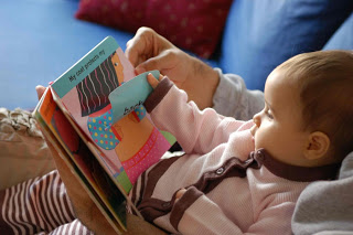
My baby loves to grab the pages and turn them. She learned how to do this when she was five months old. The key is propping up the page for her, as even an adult can have a hard time grabbing individual board book pages. So, when it's about time to turn the page, I prop it up a little with my right thumb or index finger, and she grabs the page and flops it over. When she was first learning this skill, she would just grab the page and flop it back and forth. I would guide her hand to show her how to turn it just once, and in the one direction. Gradually, she started turning the pages in a purposeful way.

At times she starts trying to turn the pages too fast, as if the fun of reading the book is just about turning the pages. When this happens, I will go back to a skill an expert nanny taught me: I tap on the board book page to draw her attention to the art. The nice thing about board book pages is that they make a good sound when you tap on them with your nail. So, that gets her to focus on the page long enough for me to finish reading it (or at least for me to say a few words, so the experience feels like reading).

Then she gets to turn the page and see what's on the next one! Yay baby!


Here is a video of my little page turner in action, when she first learned the skill (at almost exactly 5 months), a bit tentative:


And here she is at 9 months, my little speed demon page turner!

We Like Your Spots. We Like You Too!


Put Me in the Zoo
Written and illustrated by Robert Lopshire

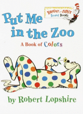
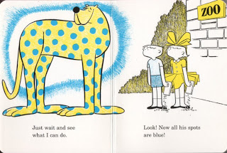
This little "Bright and Early Board Book" was a hand-me-down book from another family. We like it so much, I bought it for my sister's baby. It's about some strange creature who is desperate to get put in the zoo, and to prove he belongs there, he shows how he can make his spots change color. The two astounded children in the story suggest he might be better off in the circus. And there you have it.

If you don't mind the weird premise (please put me in a cage!), the book has a lot of visual excitement for little babies. The contrasting spots change from page to page. Our baby would actually grab the page to turn it back and look at the spots on the previous page again, like she was noticing the color change.


Babies love bright, contrasting patterns!

The text is an homage to long vowel sounds, with a particular emphasis on the "oo" sound. It is very sing-songy and fun to read. And easy to memorize without even trying!

One critique-- I think there is a missed opportunity at the end. When we see the circus on the last page, we just see the tents from the outside, from a distance. If someone didn't know the circus (like the very young children reading this book), how would they understand why this strangely talented creature belonged there? Even just a couple of monkeys on unicycles would have done it...

There's Something About Karen Katz


Toes, Ears, and Nose!
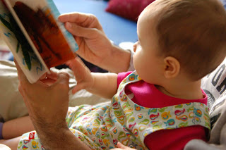
by Marion Dane Bauer, illustrated by Karen Katz

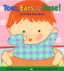
There will be other posts about Karen Katz, but I'm starting with this one, as it's my baby's favorite Katz book. It's a lift-the-flap book in which baby's various parts are hiding under clothes and other things (blanket, lollipop), and you lift the flaps to find things.

As with all the Katz books, there are colorful, baby-mesmerizing patterns and sweet round faces throughout. The cover art says it all.

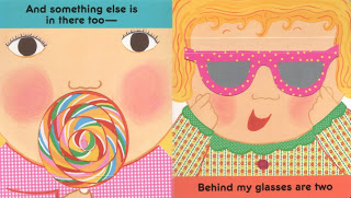
This spread gets the most coos, especially the right page:


The appearance of the bright blue eyes under those glasses gets Miss E very excited.

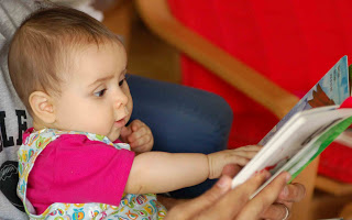
At six and a half months, my baby is all about grabbing and grappling with things, so she likes to lift the flaps herself. At first she lifts them and looks under them, but if I let her hang on too long, her "must taste everything" reflex kicks in, and she will pull them to her mouth. Ah, babies.

Anyway, I think this is a very satisfying first "lift-the-flap" book, because young babies are so fascinated with faces. In this book, there are lots of them to discover. We have really enjoyed sharing it with our girl.

Update: At age 9 months, she still loves the book-- though she especially enjoys tearing off the flaps these days. We were given two copies, and one of them is now retired due to extensive de-flapification.


Another Side of Richard Scarry


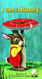
I am a Bunny
by Ole Risom, Illustrated by Richard Scarry

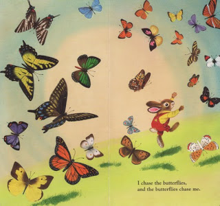
If you are most familiar with Richard Scarry's art from "Busy, Busy Town" and his various books about "things that go," this book will show you a whole other side of his talent. It has lush, painterly nature scenes in which a little bunny, Nicholas, plays with butterflies, watches birds and frogs, and takes in the changes of the seasons.

The trim of the book (tall vertical) gives each scene an a sort of grand theatrical quality. You know how opera scenery can be so big and grand that the actors look small? These tall nature scenes with a little bunny in them have a similar grandeur to them. And yet they are still so sweet. The bunny's expressions and poses are adorably childlike. Here is my favorite:


(I am no butterfly expert, but it seems that he has taken care to depict real butterflies. Same appears to be true of the birds on other pages.)

My baby seems to study the scenes; since Nicholas wears the same bright outfit in almost every scene, I think she is noticing him. Once she develops language it will be fun ask her, "Where's Nicholas?"

The text is very simple-- nothing special, but very easy and sweet to read to a baby. Just one simple sentence per spread. It is really a perfect introduction to the seasons. I can't recommend it enough! (And I thank the colleague who recommended it to me!)